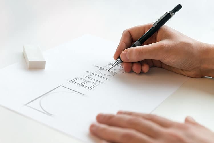
Bridgera recently introduced a new, fresh, visual identity. Here’s the story of how we combined what our customers love most about us with our core values and culture to create a bolder, more modern Bridgera.
Where we Started
From the start, a few things have distinguished the Bridgera brand:
- The energetic and powerful color of red.
- The bridge – We stand by our quest to bridge our clients to the new era of technology.
- Modernization – At our core we are an innovative tech company, and we pride ourselves on being on the forefront of modern technologies and trends.
As 2017 approached, we took a hard look at our existing brand image and came to the consensus that many aspects were tied to older technology and failed to render the message we would like the Bridgera brand to stand for. Thus began the meticulous journey to create a new, fresh, visual identity that more adequately portrayed our company as our clients perceive us – innovative and modern.
Beginning the Rebranding Journey
Our design lead, Makana Dumlao, took the old Bridgera logo and stripped it down to the basic elements. He then prioritized those elements to decide which to carry forward with the new logo to help keep our overall look consistent, while also allowing room for the changes needed for a new and improved look.
This beginning phase included significant research, involving analyzing the company culture, the company’s relationship with its clients, and the trajectory of the company. In an effort to keep the brand authentic, all external influences were blocked from the research and planning process.
Culture
As you may know, Bridgera is a software development company with a global presence. We have a team in Raleigh, NC at our headquarters and have teams offshore in India. We were founded by individuals from India and much of our client work is done offshore. To say this is a big part of who we are is an understatement. Our local teams are the “bridge” between our clients and our customers.
Clients
Our clients view us as a long term partner, or perhaps a permanent structure or “bridge”, to ensure that the solutions we develop are maintained and continually improving. This is demonstrated by our 95% retention rate.
Trajectory
Our clients recognize that Internet of Things technology, or Industry 4.0, is the future. However, they don’t consider modern software technology as one of their core competencies, creating a significant gap. Bridgera’s focus is to “bridge” the software gap for these companies.
Design + Development
After research and soul searching was complete, the process of sketching and mocking up options began. In developing mockups for the new logo, it was important for our culture to shine through in the designs.
Incorporating the image of a bridge in our logo was a no brainer for the team. The mantra ‘to bridge our clients to a new era of technology’ was born with Bridgera and remains a driving force within the company. We arrived at the crossroads of symbolism and simplicity with our new mark. The logo mark is flexible and can be used across many applications. Painted in “Bridgera Red,” the mark is a bold, visual symbol that discretely embodies our mantra.
The primary color used in our new visual identity, Bridgera Red, is a holdout from the previous version. However, to incorporate energy and a bit of modernism, a secondary color palette was developed. This secondary palette allows for greater versatility. Choosing colors for the palette was a task deliberately placed with Arpita Kirtaniya Bridgera’s newest designer in India. This decision was made as homage to the visual vibrancy associated with Indian culture.
Goals + Objectives
The overarching objective of our new visual identity is to align with our values and culture while providing the flexibility to change and adapt as we construct our future. It is crucial to push for an identity that can withstand time so that it will continue to accurately portray Bridgera as we continue to grow. Essentially, we strive for good design as defined by designer Dieter Rams:
“Good design is long-lasting. It avoids being fashionable and therefore never appears antiquated. Unlike fashionable design, it lasts many years – even in today’s throwaway society.”-Dieter Rams
We can say with confidence, the new Bridgera identity embodies the values and culture of our company. What are your thoughts on the new look? We welcome the feedback!
